The focal point that I was given was a piano, I used that focal point to help me create this sun room/ entertaining space.
Saturday, December 26, 2015
Friday, December 18, 2015
Friday, December 11, 2015
Tuesday, December 8, 2015
The Great Gatsby
This week our scenario was to create two mood boards for a client that wants there space inspired by The Great Gatsby themed. In order to not go too cheesy with attempting to recreate or even make their home seem like a movie set I view it more as they wanted a jazz age, also known as the Art Deco period which is explained a bit in Get the look: Great Gatsby. There are two options of style when it came to this era. There is the glamour of the Roaring Twenties, which is most represented because of how extraordinary and over the top they could be while managing to remain elegant. The less popular seen style would be the contemporary monochrome with it's cozy feeling invoked from all plumped cushions, muted bright colors such as yellow as well as calming neutrals. If you would like to read more about these styles the link is Great Gatsby-Design Tips.
In terms of what I designed with this mood board I imagined that my clients asked me to help them design a Speakeasy Throwback Club/Bar. The first board that I created is centered around the bar and seating portion of the establishment. I stuck with the more glamorous style when designing.
To start off the chandelier is meant to big because even though in speakeasy's at the time they were not there but in The Great Gatsby when he threw his big parties my eye was always drawn to that huge and daunting chandelier that just added a regal factor to the space.
The bar took me sometime in trying to find. I wanted to make it unique and what is more unique then having a bar that is completely covered in mirrors. The light from the club could also give a fun effect when it is bounced off of the interesting mirrored panels. The article that gave me the inspiration to have this unique bar was Get the Look: Great Gatsby
I wanted to keep the theme not only in the furniture but also the actual architecture of the building. I wanted to have these interesting tin decorative ceiling panels that, other than the picture shown in the mood board would be a shinny silver color. In the case of it being to much I would like to have the cross beams as well.
Aside from the only seating being at the bar I chose to have simple tables that will be set around for the costumers to be able to enjoy their drinks, talk and take a break from dancing. I went with a simple black set of table and chairs because it is still classy and will flow with the rest of the space. It also has a practical function of being easier to clean unlike white. I took a tip from the article of Gatsby Tips that pointed out that you don't want to go over board with whites, silvers, and golds. The black is a good complimenting color to the rest of the pallet that's being used.
For my other mood board I wanted to work on the exterior of the establishment. I imagined that the client just so happened to have a location a hill that would warrant a wonderful view. Let's say the client wanted to offer a balcony area to their costumers that way, perhaps, they could get some fresh air and take a break from the club. I wanted this space to be simple but still hold the theme and the style of the era. The people who take the time to be there, I feel, should enjoy the view of the beautiful modern city around them. One of the first things I want to make sure of, for safety purposes, was that these guests had enough light. Needing light doesn't mean it can't still be a form of romantic lighting which was very popular during that time. I decided to add hanging Edison bulbs from a simple frame work for a roof with no roof actually in place so that they can look up and enjoy the stars. If romantic lighting was popular I want to definitely add that to the club. Having some seating outside is important but I wanted most of it to be just open space. I stuck with the classy black and white. There wasn't anything in the articles provided to us about outdoor furniture. Although, with a little more research I found that in that time they would use lawn chairs typically. So with that I wanted to try and use classy lawns chairs that would be easy to clean. In the chance that the guests would bring their drinks outside I added this wonderful Art Deco table. Art Deco was very popular back in the 1920's. The style would range from art, that I also added, to furniture and architecture itself. It is also gold, which at the time was used a lot. I also added a few art pieces just to spice up the space a bit. I made sure that they were modern throwbacks that fit the style and era.
In terms of what I designed with this mood board I imagined that my clients asked me to help them design a Speakeasy Throwback Club/Bar. The first board that I created is centered around the bar and seating portion of the establishment. I stuck with the more glamorous style when designing.
To start off the chandelier is meant to big because even though in speakeasy's at the time they were not there but in The Great Gatsby when he threw his big parties my eye was always drawn to that huge and daunting chandelier that just added a regal factor to the space.
The bar took me sometime in trying to find. I wanted to make it unique and what is more unique then having a bar that is completely covered in mirrors. The light from the club could also give a fun effect when it is bounced off of the interesting mirrored panels. The article that gave me the inspiration to have this unique bar was Get the Look: Great Gatsby
I wanted to keep the theme not only in the furniture but also the actual architecture of the building. I wanted to have these interesting tin decorative ceiling panels that, other than the picture shown in the mood board would be a shinny silver color. In the case of it being to much I would like to have the cross beams as well.
Aside from the only seating being at the bar I chose to have simple tables that will be set around for the costumers to be able to enjoy their drinks, talk and take a break from dancing. I went with a simple black set of table and chairs because it is still classy and will flow with the rest of the space. It also has a practical function of being easier to clean unlike white. I took a tip from the article of Gatsby Tips that pointed out that you don't want to go over board with whites, silvers, and golds. The black is a good complimenting color to the rest of the pallet that's being used.
For my other mood board I wanted to work on the exterior of the establishment. I imagined that the client just so happened to have a location a hill that would warrant a wonderful view. Let's say the client wanted to offer a balcony area to their costumers that way, perhaps, they could get some fresh air and take a break from the club. I wanted this space to be simple but still hold the theme and the style of the era. The people who take the time to be there, I feel, should enjoy the view of the beautiful modern city around them. One of the first things I want to make sure of, for safety purposes, was that these guests had enough light. Needing light doesn't mean it can't still be a form of romantic lighting which was very popular during that time. I decided to add hanging Edison bulbs from a simple frame work for a roof with no roof actually in place so that they can look up and enjoy the stars. If romantic lighting was popular I want to definitely add that to the club. Having some seating outside is important but I wanted most of it to be just open space. I stuck with the classy black and white. There wasn't anything in the articles provided to us about outdoor furniture. Although, with a little more research I found that in that time they would use lawn chairs typically. So with that I wanted to try and use classy lawns chairs that would be easy to clean. In the chance that the guests would bring their drinks outside I added this wonderful Art Deco table. Art Deco was very popular back in the 1920's. The style would range from art, that I also added, to furniture and architecture itself. It is also gold, which at the time was used a lot. I also added a few art pieces just to spice up the space a bit. I made sure that they were modern throwbacks that fit the style and era.
Tuesday, December 1, 2015
Space
In order to create separate spaces in my studio apartment I tried utilizing the furniture. I mostly used this with the living room. I used a curved couch and the corner of the room to designate that space separate. As for the kitchen I have an island that I will use as a table. I do not see a big need for an actual dining room table because it will most likely just be me living there I made sure to put some space between the kitchen and my bedroom. I would ideally place a room divider there in order to further the separation and in the chance that I would have guest over, I can keep that area more private and to myself. I don't like clutter so I only wanted to put in as much furniture and such as I needed. I love wide open spaces so the windows I have added will give the apartment a more open feel to it.
Tuesday, November 10, 2015
Line
When it comes to the elements of design, line is one of the most common that we are aware of. Line has a way of adding to a space in a variety of different ways as well as invoking a feeling while we observe the room. Most of the time we will not know that we are subliminally being effected by these lines.
Vertical Lines:
The vertical lines in this example would be the shelves. They bring your eye up toward the ceiling and down toward the ground. The feeling that comes with a line would be formality, organization, and class.
Horizontal Lines:
Horizontal lines have a tendency to move your eye along the way from side to side rather then up an down like vertical lines did. These lines give you a cozy, casual feeling. A place you can relax and be comfortable. It is easiest to remember this because you sleep horizontally and that is a very casual and relaxing position. The shelves and the stacking order is where the horizontal lines are present.
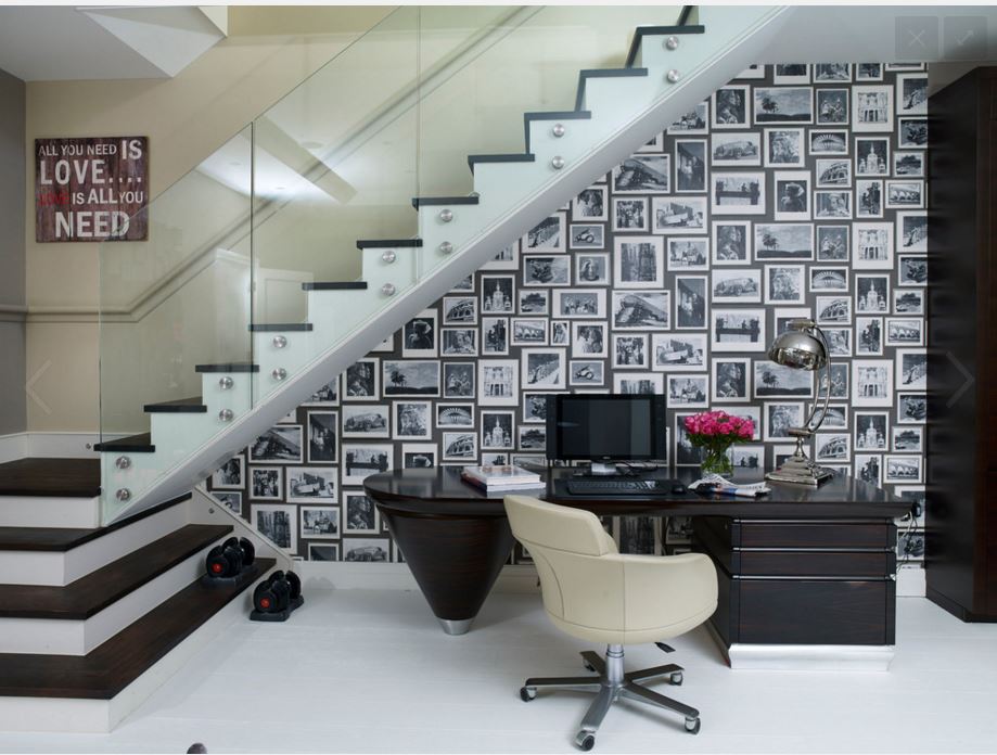
These lines are very exciting and energized and give life to a room or space. The example shows diagonal line with the staircase. It makes the space feel a little more lively.
Curved Lines:
Curved lines is a soft and calm line. It is also seen as a feminine line. The example shown incorporated the curve line with an arch doorway and with the filigree around it.
There are many types of lines in a home and the way they can make us feel also varies from line to line. Why not go around your house or any building/interior space and notice the lines around you and see if that is effecting how you feel.
Texture
Texture is a very important tool that an Interior Designer has. There are three different types of texture that I have used in this particular example to get a better understanding of the use of texture and how it affects a space.
The first example would be Visual texture. Visual texture is simply the appearance of the surface. For the sample room I created I showed this in the pillows on the ottoman as well as the ottoman itself. The pillows have this leather like quality but other than that they appear to be smooth which is a nice contrast to the busy print that is on the ottoman. I also added a unique and colorful glass chandelier and the painting that hangs along the staircase.
Tactile, the feeling of the surface, is also present in the sample room. It's shown in the bed frame that has a woven basket like texture to it. The clock above the bed also shows this kind of texture. The basket and the room divider also show it. The interesting thing about the room divider is that there are two different textures that are used in making it. This gives it a unique feeling if it is touched.
The final type of texture that I used in creating my sample room is known as audible. Audible is the sound that the surface makes when it is rubbed. Everything has a sound when it is touched. This is probably the easiest texture to confuse or simply look over. To show this I tried to pick things that would be obvious and would make very different sounds from each other. I have the cabinet by the staircase. The cabinet has glass and some metal work on top. To contrast that I added the bed side table which is made from a section of wood and will have a rougher sound. I also added the books on the bed side table to give a various because it appears that the books have leather bound covers. Finally, the chest at the foot of the bed would have a smoother sound that would be broken up because of the leather straps that go around it.
Texture is a very important thing when it comes to Interior Design. Learning and understanding how to use and apply it properly to a space will get you very far.
Subscribe to:
Posts (Atom)